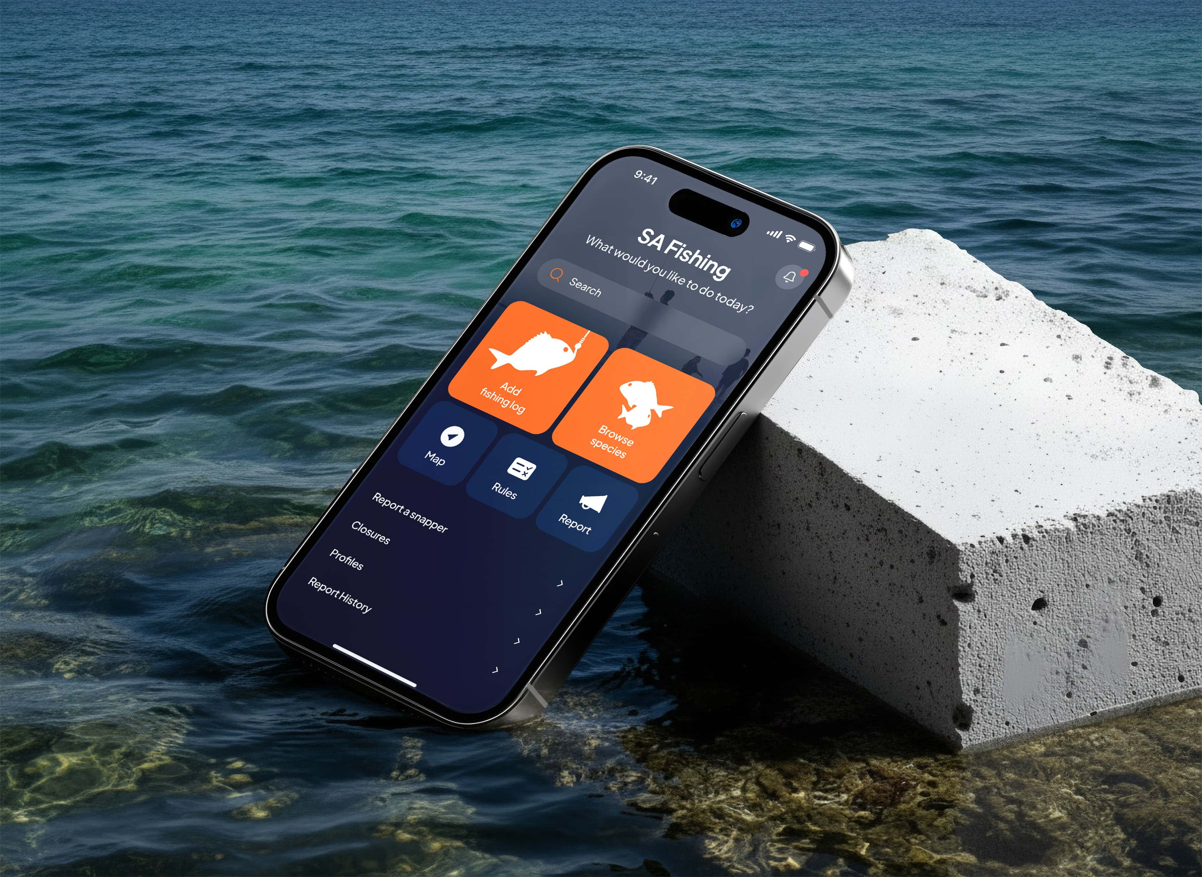
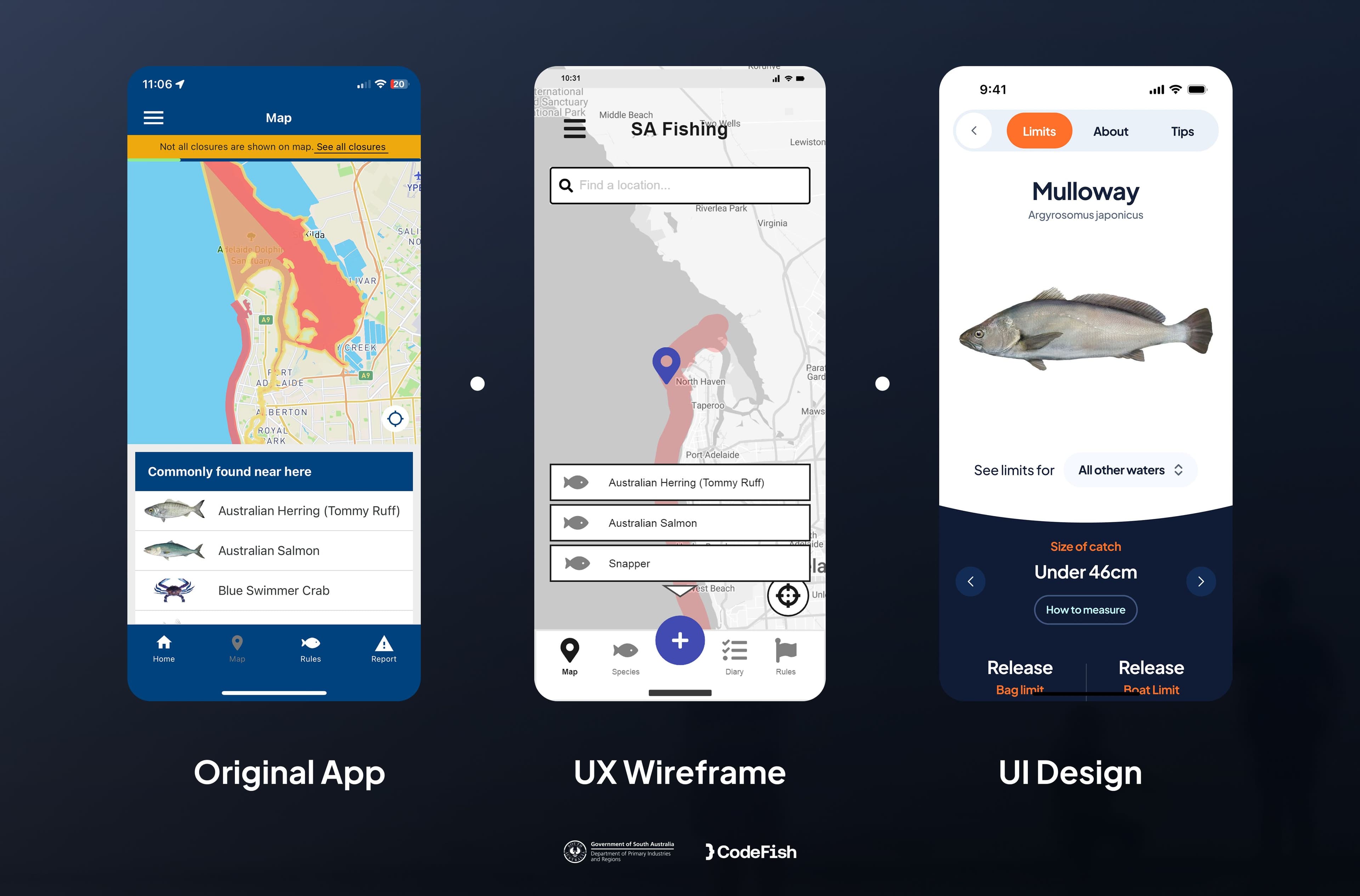
Discovery with PIRSA stakeholders set three non-negotiables: usability, offline-first function, and information a person can act on without interpreting it. Everything after that was measured against those.
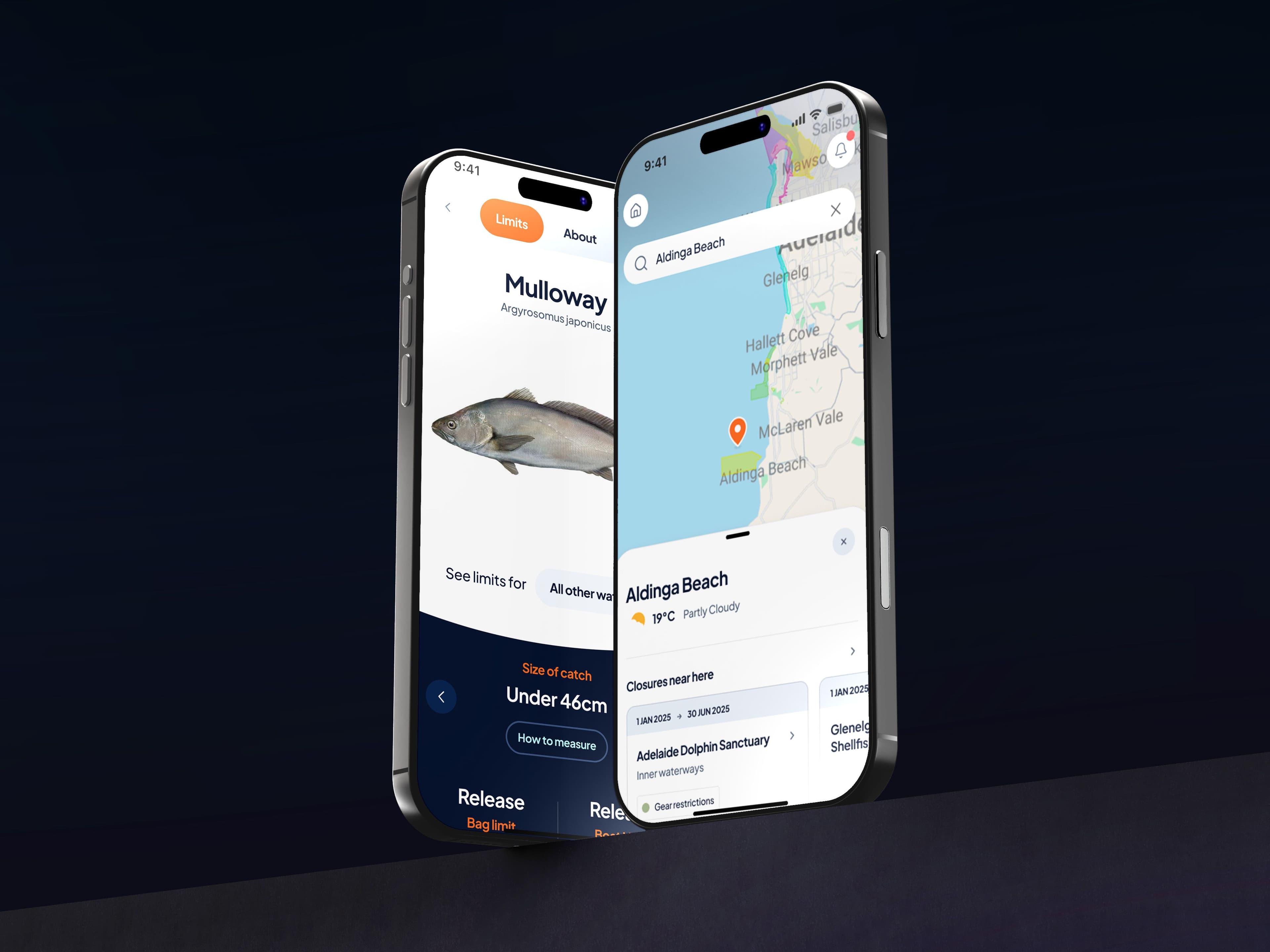
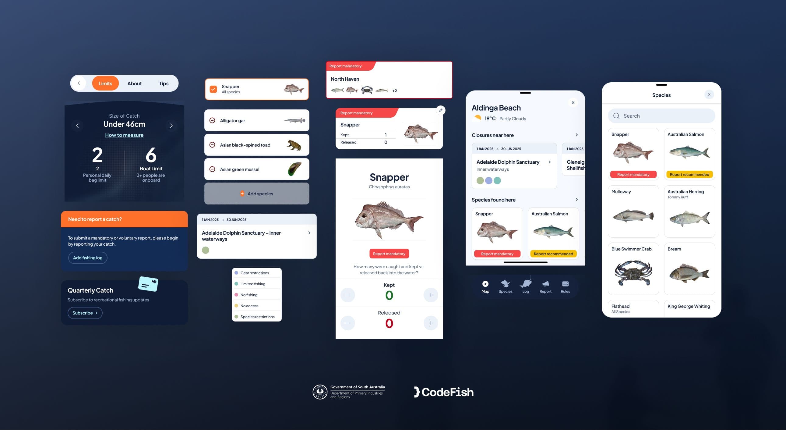
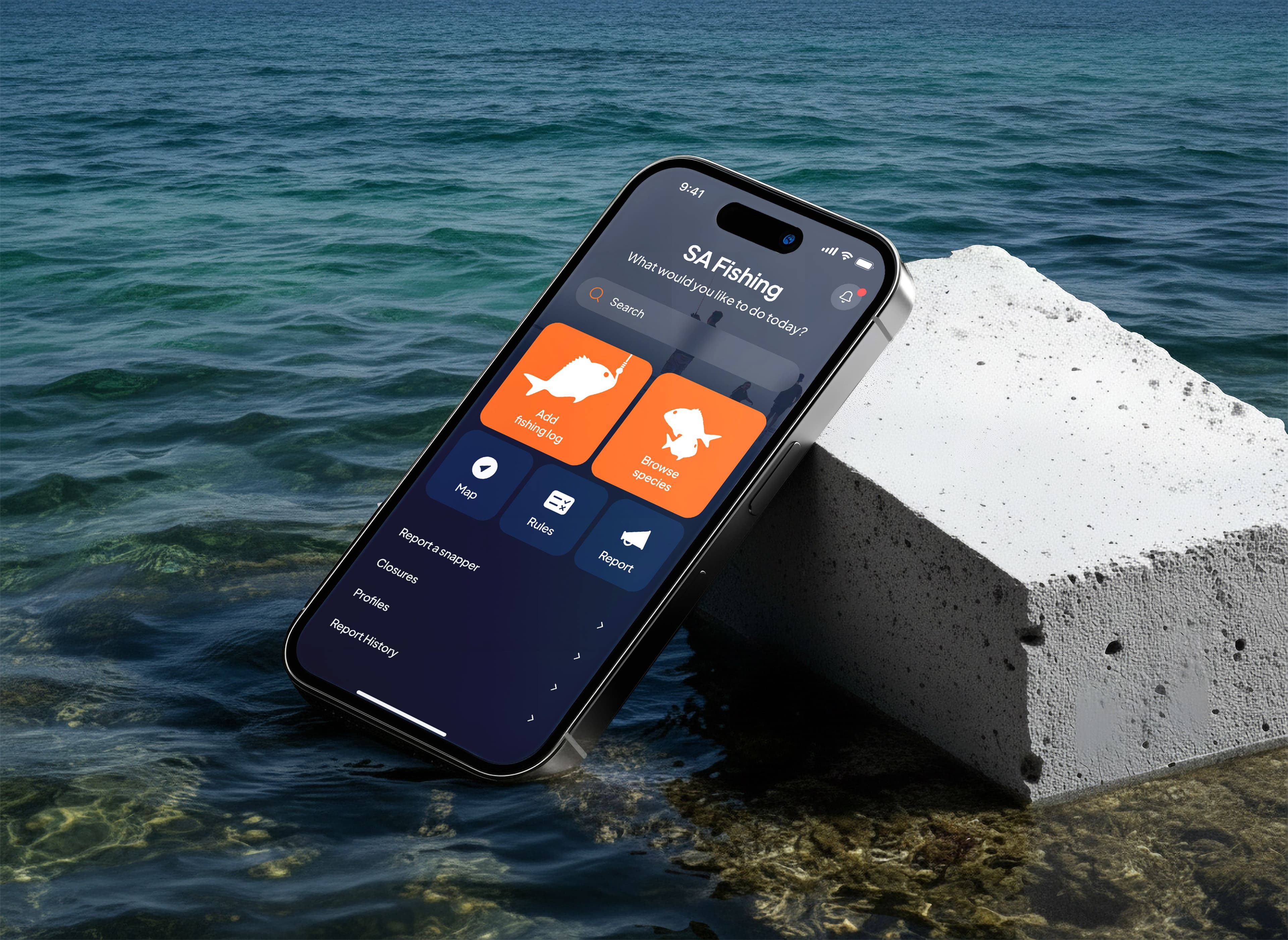
The interface was designed in Figma and kept deliberately shallow. Someone checking a bag limit is often standing in wind and glare, holding a rod, with wet hands — so the design question was not how much the app could show, but how few taps it takes to get one answer.
We built it in React Native, so iOS and Android come from a single codebase. For a government project that means faster delivery, consistent behaviour across devices, and one thing to maintain rather than two.
Offline-first was the hardest part and the most important. Rules, maps and species guides are held on the device, so the app behaves the same with no bars as with full reception. We then tested with end users and PIRSA stakeholders before launch, because an app people cannot use is a compliance problem, not just a usability one.