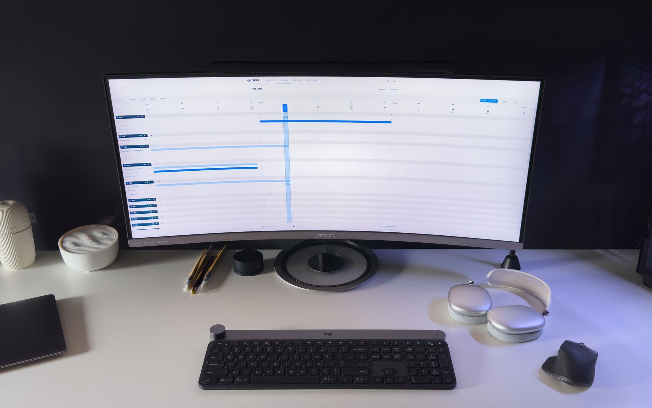
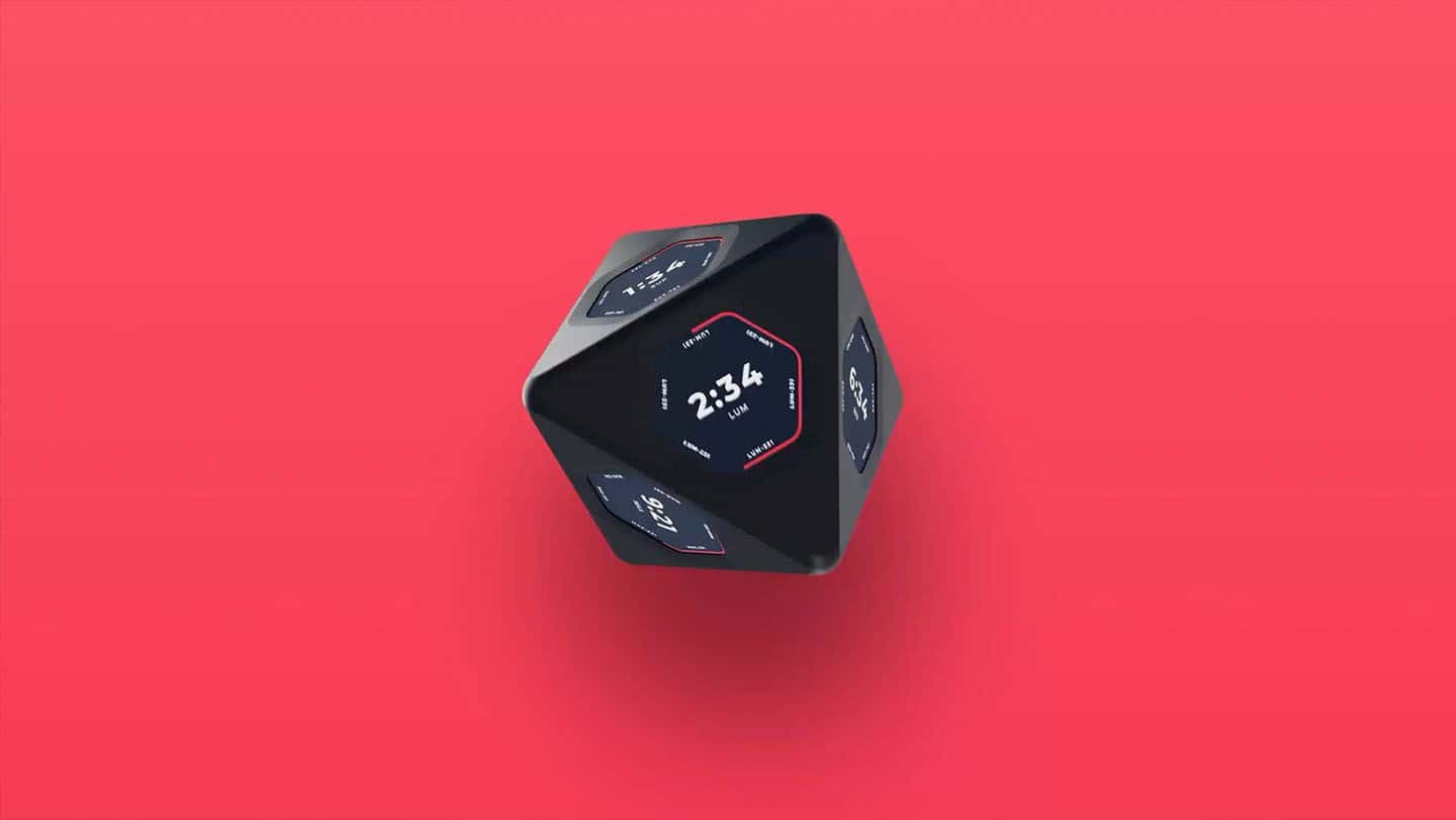
The work started with a user experience review of the existing product alongside a deep dive into what the underlying technology could and could not support. Running both at once meant the design was grounded in what the hardware could actually deliver, rather than producing a concept that had to be cut back later.
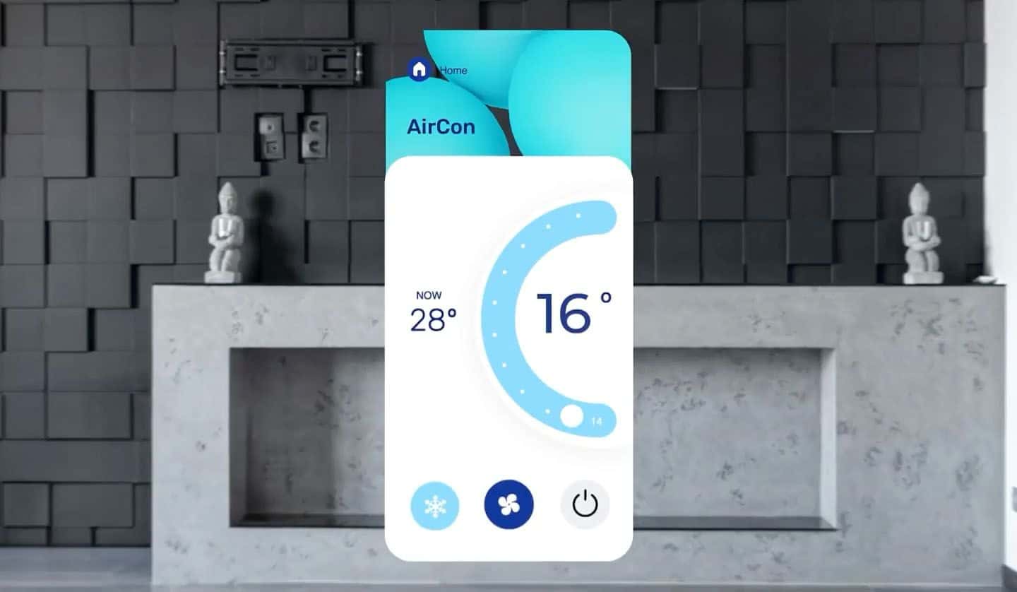
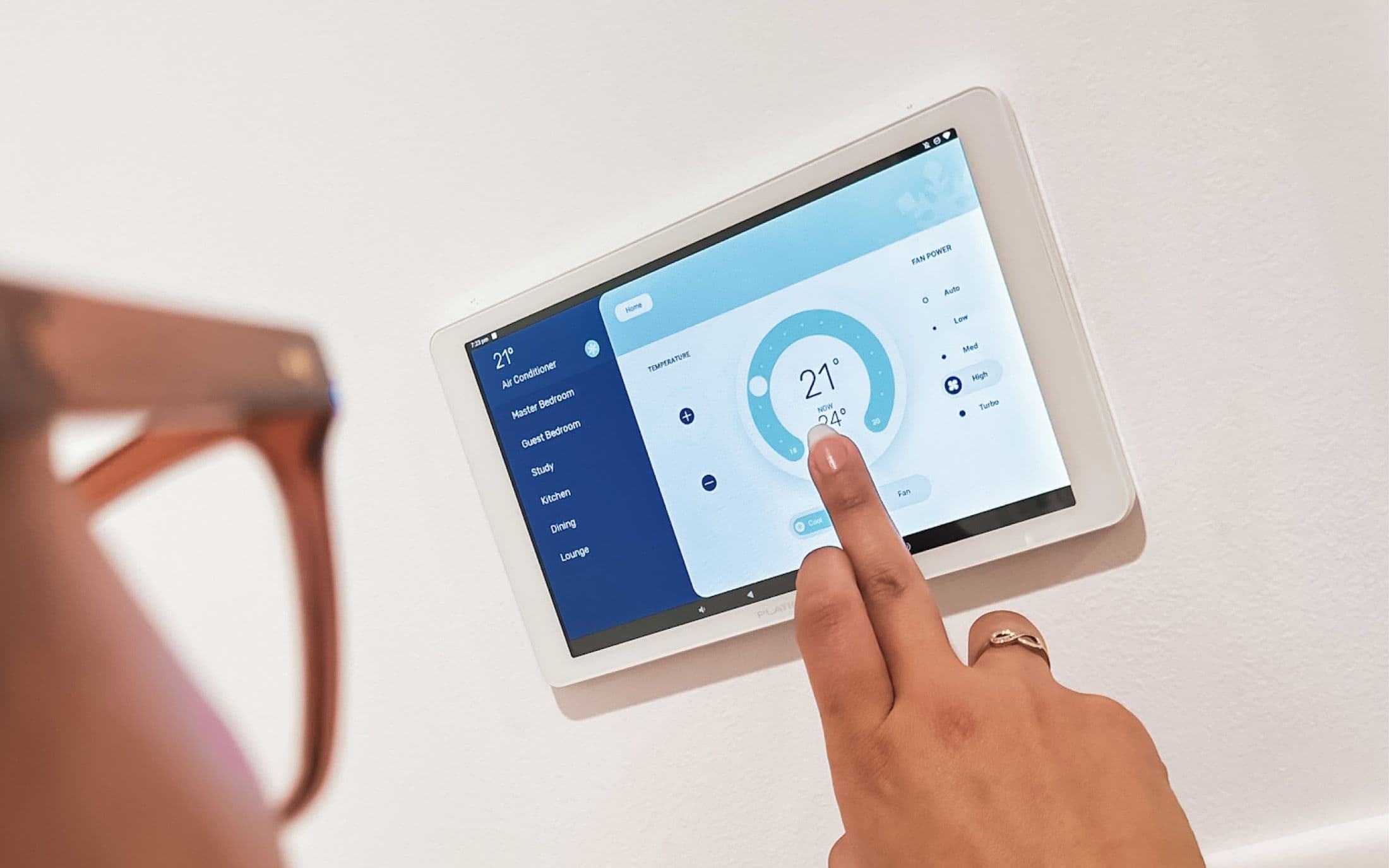
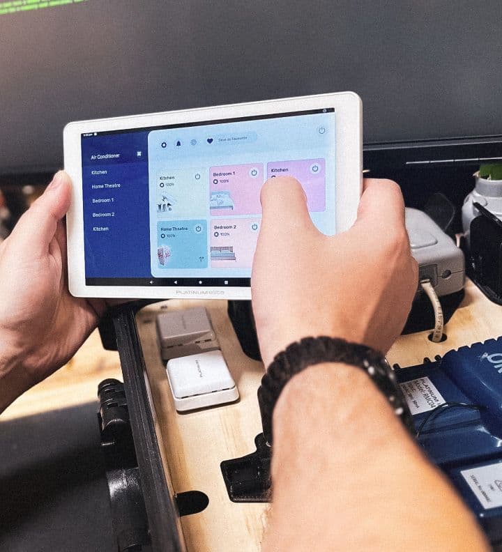
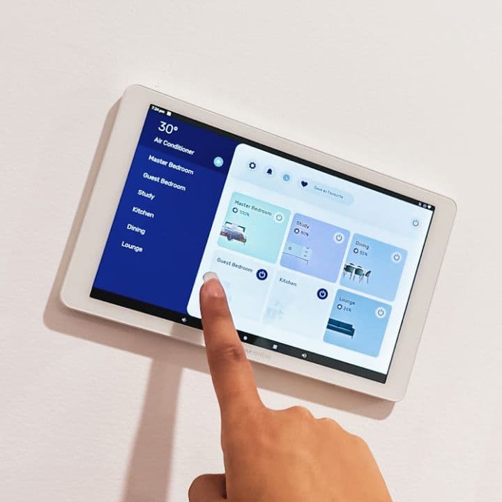
That review set the path for the UI design phase and the development plan. On the design side we focused on making the interface modern and genuinely functional — clear at a glance, on a panel someone walks past rather than sits down at.
On the engineering side the plan was to improve the underlying technology while adding features, and to structure it so more could be added later without another rebuild. Building on a JavaScript stack is what made that possible: it took the risk out of planning new features, because shipping one no longer means re-opening the foundations.
Existing client hardware was reused throughout. The upgrade reached the product ADA already had rather than requiring a new one.