UI Design

UI design delivered as production-ready Figma files with documented components, so what ships matches what was designed as the product grows.

Where does UI design fit?

UI design is the visual and interaction layer of a product: colour, typography, spacing, motion, and the library of components every screen is assembled from. CodeFish treats it as a production deliverable rather than a set of pictures — documented components, defined tokens, and interaction notes a developer can build from without asking questions.

It sits after UX, which decides how the product is structured and what the user is trying to do. UI decides how that structure looks and feels on screen. Running UI without UX produces a product that looks resolved and works badly.

Where it usually goes wrong is the handover. Components get interpreted differently, spacing drifts, and what ships is a rough approximation of what was designed. That is a documentation problem, not a talent problem, and it is fixable up front.
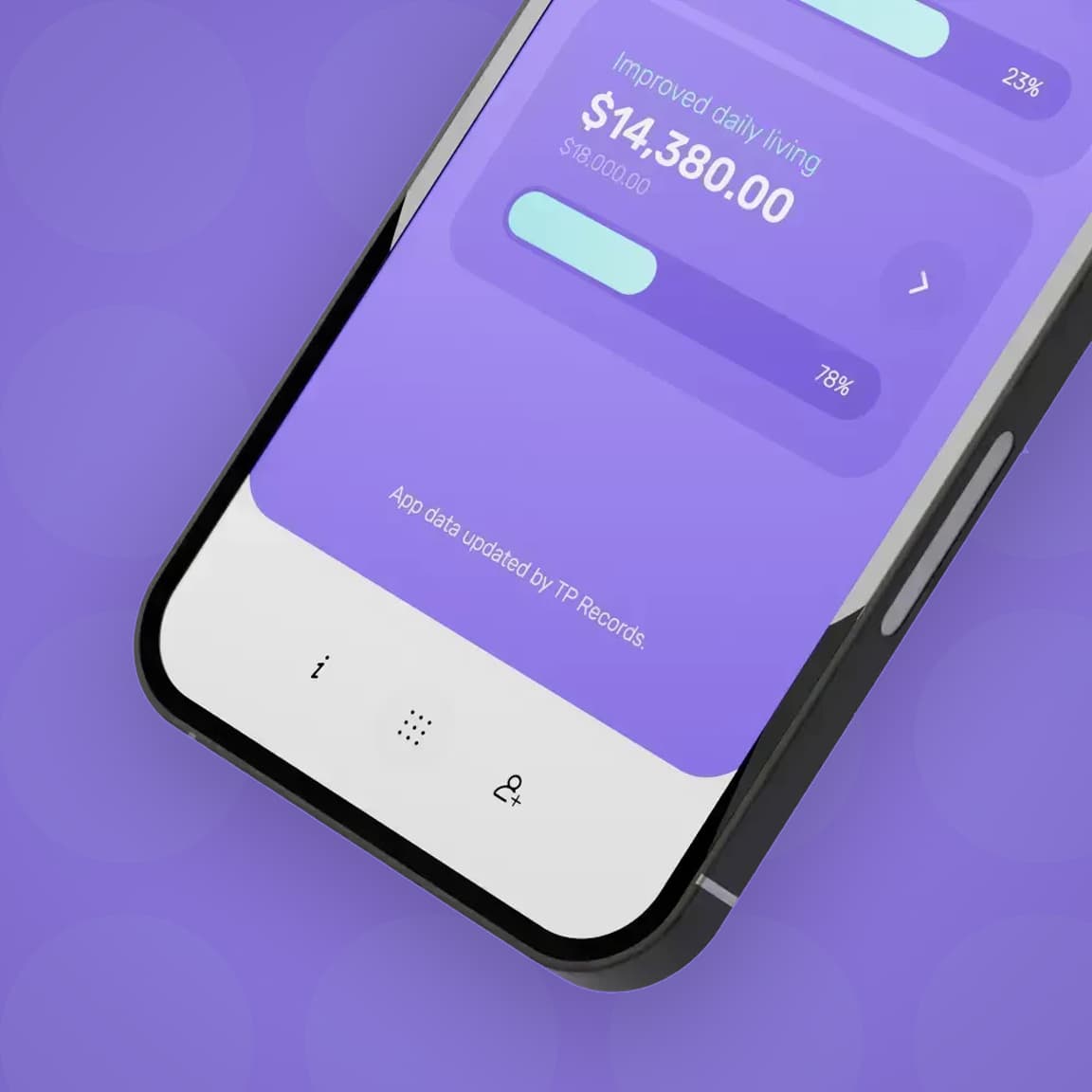
Phone screen showing a funding balance of $14,380.00 against an $18,000 budget with progress bars

How does a design survive the handover?

Most UI design breaks down at the point it moves to development. Components are interpreted differently, spacing is inconsistent, and the product that ships looks like a rough approximation of what was designed. We prevent that by treating the handover as part of the design process, not an afterthought.

Our UI work produces production-ready Figma files with documented components, defined tokens, and interaction notes that remove the ambiguity. Developers know exactly what to build. The product that ships matches the design.

How UI design works

Define the visual language

Colour, typography, spacing, and motion — the design decisions that govern everything else. We establish a visual language that fits your brand, works across platforms, and scales as the product grows.

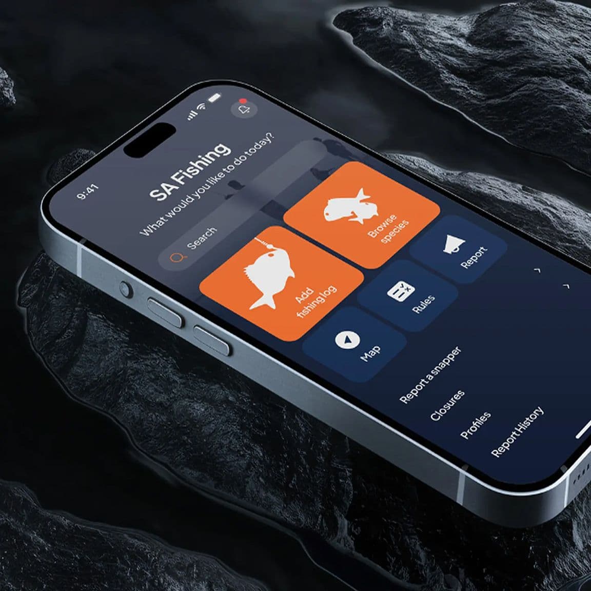
SA Fishing app home screen on a phone over dark rock, with add fishing log and browse species tiles

Build the component library

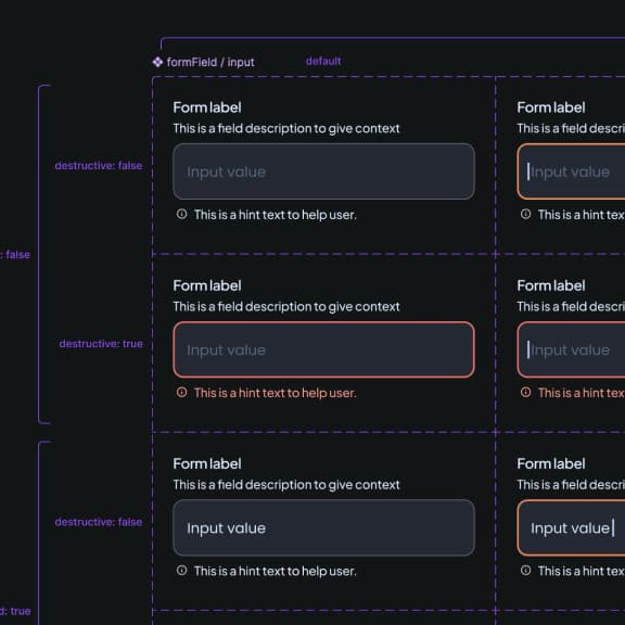
Every UI element designed as a reusable component with defined variants, states, and documented behaviour. Built in Figma with auto-layout and tokens so the library is maintainable, not a snapshot that goes stale.

Hand over for production

Annotated screens, interaction specifications, and a handover review with the development team. We stay involved through build to answer questions and catch anything that has drifted from the design before it ships.

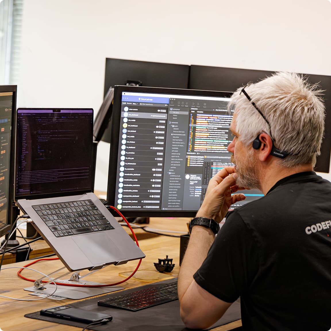
A CodeFish developer reviewing a project's commit history on screen

What you sign off should be what ships, not a mockup a developer has to reinterpret.

What does UI design cover?

Visual design

Screens, layouts, and visual hierarchy that communicate clearly and reflect your brand. Designed for the platforms and contexts your users actually work in.

Design systems

A component library and token set your team can maintain and extend. Built to grow with the product, not to be rebuilt every time scope increases.

Developer handover

Production-ready Figma files with documented components, spacing, and interaction notes. Developers build from the design, not from memory of a meeting.

Tools and methods

What we use to do the work

  • Figma

  • Design tokens

  • Auto-layout

  • Component libraries

  • Accessibility (WCAG 2.1)

  • Responsive design

  • Motion design

  • Dark mode

  • iOS design guidelines

  • Android material design

  • Design systems

  • Figma variables

What does a UI design engagement look like?

Picture a customer portal built over three years by four different developers. Every page works, but no two look alike. There are six shades of blue, four button styles and three ways of showing an error. Each new feature takes longer than it should, because the developer has to decide how it looks before they can build it, and the answer is different every time.

The work starts with an audit: every screen captured, every colour, font size and component counted. That shows which patterns are already doing the job and which are noise. From there we define a small set of tokens for colour, type and spacing, and design one version of each component, with every state named: default, hover, disabled, error, loading.

The developers then swap the old styles for the new components one area of the portal at a time, rather than in a big-bang redesign. New features get built from the library straight away. The result you can see is a portal that looks like one product. The result you can measure is how long the next feature takes to design and build, and how few questions the developers need to ask along the way.

UI design questions we get asked

UI design is the visual and interaction layer of a product: colour, typography, spacing, motion, and the reusable components each screen is built from. The deliverable is a documented component library and production-ready files a developer can build from directly, not a set of static screens. It follows UX, which decides how the product is structured before any of it is drawn.

UX decides how a product works — the structure, the flow, and what happens when something goes wrong. UI decides how it looks and behaves on screen — layout, colour, typography, and component states. They fail differently: a plain interface on a sound structure still gets used, while a polished interface on the wrong structure gets abandoned and rebuilt. Most products need both, either together or in sequence.

Cost is driven by the number of unique screens and whether a design system is being built or extended. Applying an existing system to a defined set of screens is a small fixed-price piece of work. Building a component library and token set from scratch for a full product is larger. Either way it is quoted fixed-price before it starts, and a design system usually pays for itself in reduced build time.

Applying an existing design system to a defined screen set typically runs one to three weeks. Building a visual language and component library from scratch usually runs four to eight weeks, overlapping with development rather than blocking it. The handover review at the end is short but is the step that decides whether what ships matches what was designed.

Ask to see the handover files, not the portfolio shots. Documented components, defined tokens, named states, and interaction notes are what a developer actually builds from, and their absence is the reason most products ship looking different to the design. Ask whether accessibility is built in or checked at the end. And confirm you own the files outright.

We hand over in a working session with your developers, not by emailing a link to a Figma file. Before that session, every component is documented with its states, spacing and tokens, and every screen is annotated with how it behaves: what happens on tap, on error, on a slow connection. In the session we walk your team through the library, agree how the tokens map to their code, and answer questions while they are fresh. We then stay available through the build to review what ships against the design and catch drift early, while it is still a quick fix rather than a redesign.

A design system stays current when someone owns it and new work goes through it, not around it. At handover we agree who on your side owns the library, often a lead developer or product owner, and set a simple rule: a new screen uses existing components, and a genuinely new component gets designed, documented and added before it is built. The Figma library and the code library should change together. If you do not have a designer in-house, we can review changes on a regular schedule so the system grows with the product instead of splitting into a second version nobody maintains.

Yes. We translate your brand guidelines into a UI system: the specific colour scales, typography settings, spacing values, and component styles that make a digital product feel on-brand without being a literal reproduction of a style guide written for print.

Yes. We design for web, iOS, and Android, and for cross-platform products that need to feel native on each. Responsive web design and platform-specific mobile patterns are part of how we work, not extensions we add at the end.

We will audit it, extend it, and fix what is not working. Existing design systems often have gaps or inconsistencies that accumulate as products grow. We identify what is load-bearing and what needs to be rebuilt, and we do that work without discarding what is already good.

Yes. That is the standard we hold our handovers to. Any competent development team should be able to build from our Figma files without needing us in the room. If they have questions, the answer should be in the file.

Yes. Colour contrast, focus states, touch target sizes, and screen reader-friendly structure are built into how we design, not checked at the end. We design to WCAG 2.1 AA as a baseline, and can target AAA where required.

Yes, outright. The Figma files, the component library, and the tokens are yours to keep, extend, and hand to any developer. A design system you cannot maintain without the agency that built it is not a design system, it is a subscription.

Who we work with

Air Diffusion Agencies (ADA)
BreedBuddies
CERES TAG
Energy Flex
MAXMINE
TP Records
Department of Primary Industries (PIRSA)
Vodafone
Seeley