UX Design

UX design decides how software behaves before anyone draws it. Research, journey mapping, wireframes, and testing with the people who will use it.

What is UX design, really?

UX design is the work of deciding how a product is structured and how it behaves — what the user is trying to do, in what order, and what happens when it goes wrong — before any of it is drawn. CodeFish runs UX as research and validation rather than decoration: interviews and observation first, journey maps and wireframes second, testing with real users before a line of code is written.

It is distinct from UI design, which is how the product looks: layout, typography, colour, and component behaviour. Both matter, but they fail differently. A clumsy-looking product that works still gets used. A good-looking product built on the wrong structure gets abandoned, and the rebuild costs several times what the research would have.

The measurable point of UX is fewer support tickets, less training, faster task completion, and less rework during the build.

Why research before design?

Most UX problems are not design problems. They are understanding problems. Teams build what they think users need instead of what users actually do. We fix that by starting with research and validation, not with wireframes.

We map how people move through your product, where they slow down, where they drop off, and what they are actually trying to accomplish. Everything we design flows from that. The result is a product that earns usage rather than demanding it.

How UX design works

Research

User interviews, contextual observation, and a review of what already exists. We talk to the people who will use the product before we form an opinion about what needs to change. Assumptions get tested here, not later.

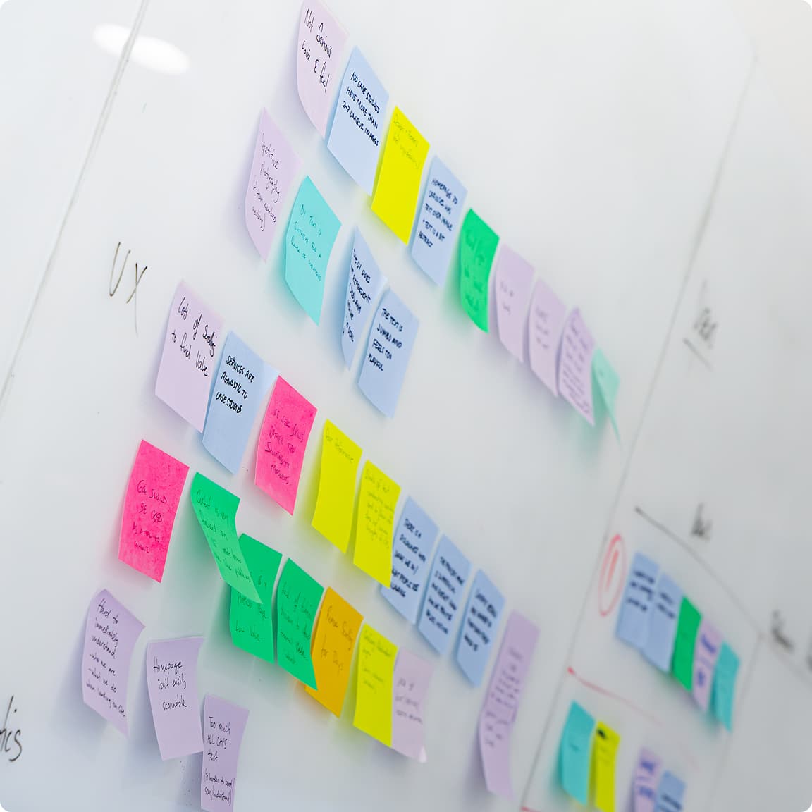
A whiteboard covered in colour-coded sticky notes from a UX workshop

Map and design

Journey maps, information architecture, wireframes, and interactive prototypes. We design iteratively, test ideas when they are still cheap to change, and refine before anything moves to visual design or development.

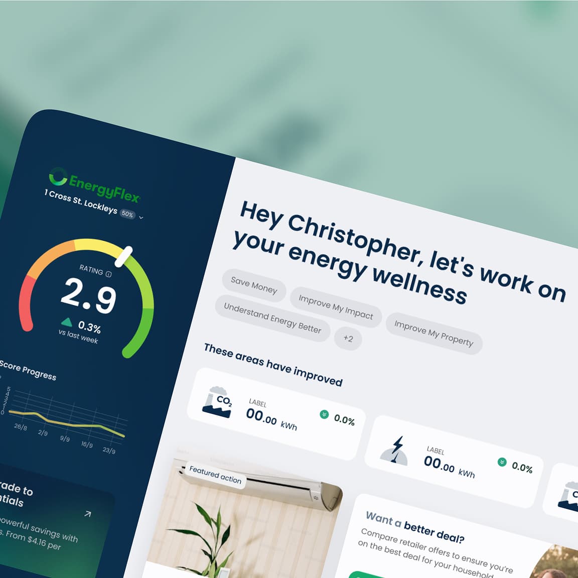
EnergyFlex dashboard showing a 2.9 energy rating gauge, score progress chart and improvement actions

Test and validate

Usability testing with real users against defined tasks. We measure whether the design works, identify where it does not, and iterate before handing over to development. Validation is not optional.

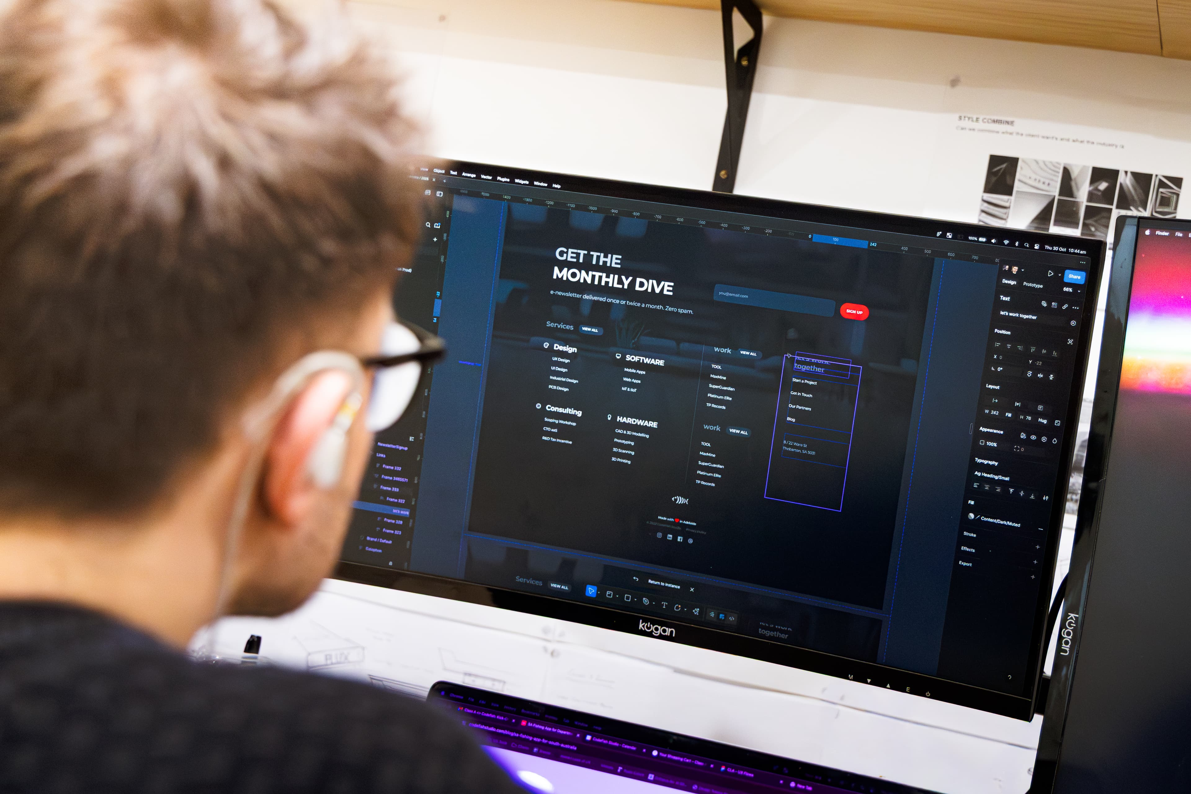
A designer reviewing a website layout in Figma on a large monitor

Tools and methods

What we use to do the work

  • User interviews

  • Contextual enquiry

  • Usability testing

  • Journey mapping

  • Information architecture

  • Wireframing

  • Prototyping

  • Card sorting

  • Heuristic evaluation

  • Accessibility auditing

  • Design sprints

  • Figma

A clumsy product that works still gets used. A polished one built on the wrong structure gets abandoned.

What UX design covers

User research

Interviews, contextual enquiry, surveys, and analysis of existing usage data. We find out what users actually do, not what they say they do.

Journey mapping & IA

End-to-end journey maps and information architecture that defines how the product is structured before a single screen is designed.

Wireframing and prototyping

Low and high-fidelity wireframes and interactive prototypes for testing and stakeholder alignment. Built in Figma, handed over clean.

What does a UX engagement find?

Picture an internal job-booking app that office staff avoid. They keep a spreadsheet open beside it and only enter jobs into the app at the end of the day, so the schedule is always hours out of date. The brief arrives as a request to rebuild the app.

Research changes the brief. Watching four or five people book real jobs shows the problem is not the look of the screens. Booking a job takes eleven steps across three screens, and the one thing staff need while on the phone, which crew is free on Thursday, sits on a fourth screen they cannot see while typing. The spreadsheet exists because it shows both at once.

The fix is a single booking screen with crew availability beside the form, tested as a clickable prototype with the same staff before any code is written. The development work that follows is a few weeks of change to one part of the app, not a rebuild, and the measure is simple: whether jobs are entered while the caller is still on the line.

UX design questions we get asked

UX design decides how a product is structured and how it behaves: what the user is trying to achieve, in what order, and what happens when something goes wrong. It covers user research, journey mapping, information architecture, wireframing, and usability testing. It is not visual design — that is UI — and the two fail in different ways. A poor interface on a sound structure is fixable; a polished interface on the wrong structure needs a rebuild.

Cost depends on how much research the product needs and how many flows are in scope. A focused piece — a heuristic review, a handful of user interviews, and wireframes for one core journey — is a small fixed-price engagement. A full research-through-tested-prototype scope for a complete product is larger, and is quoted fixed-price before it starts. If you are not sure which you need, a scoping conversation costs nothing.

A focused engagement on one core journey typically runs two to four weeks. A full product scope — research, journey mapping, wireframes, prototype, and usability testing — usually runs six to ten weeks, depending on how quickly we can get access to users. Testing rounds are the part most often compressed, and the part that most often pays for itself.

Ask to see the research, not just the screens. A partner who can show you what they learned, what it changed, and what they got wrong in testing has actually done the work. Ask whether they test with real users or only with stakeholders. And ask what you own at the end: the files, the research, and the right to hand it to another team should all be yours.

Five users per round of testing is usually enough to find most of the problems in a flow. The value comes from testing more than once, not from testing with more people: five people find the big issues, we fix them, and the next five tell us whether the fix worked. If your users fall into distinct groups, such as office staff and field crews, plan on four or five from each group, because they hit different problems. For research interviews at the start, six to eight people across those groups gives enough to see patterns rather than one person's preferences.

Research is usually a small share of the build budget, and it is cheapest when it happens before any code is written. A focused round of interviews and testing on one core journey costs a few weeks of design time. Changing the structure of a product after it is built means reworking screens, data and logic that developers have already finished, and often retraining the people using it. That is the comparison that matters: a few weeks of research against rework on the most expensive part of the project. We quote research as a fixed price, separately from the build, so you can see both numbers.

When your users are hard to reach, we go to them and keep the sessions short. Field workers, farmers, clinicians and shift staff rarely have an hour to spare at a desk, so we test on site, over a phone call during a break, or with a prototype they can try in ten minutes on their own device. We ask you to help with introductions, because a request from someone they know gets a much better response than one from us. Where we still cannot reach enough people, we lean on support tickets, usage data and the staff who deal with those users every day, and we say clearly which findings rest on thinner evidence.

At minimum, five to eight representative users for a research phase gives us enough signal to work from. More is better, but a small number of well-selected participants reveals the majority of usability issues. If you have limited access to users, we can work with what is available and supplement with desk research and competitive analysis.

Yes, and that is often where UX work has the most immediate impact. We start with a heuristic review and, where possible, an analysis of existing usage data or support tickets. That tells us quickly where the product is failing users before we go near research.

Deliverables depend on the scope, but typically: a research findings document, journey maps, annotated wireframes or a clickable prototype, and a recommendations summary. Everything is produced in Figma and documented so your team or another designer can continue from where we leave off.

Both, depending on the project. For greenfield products we typically run UX ahead of development so designs are validated before build begins. For iterative work on existing products we run alongside development, designing and testing features as they move through the backlog.

UX defines how the product works: structure, flow, and interaction. UI defines how it looks: visual design, typography, colour, and component behaviour. They are connected — a polished interface built on a flawed structure still fails users. We do both, either together or in sequence depending on what your project needs.

Yes. The research findings, journey maps, wireframes, and prototypes are yours, handed over in Figma files your team or another designer can continue from. No licence, no ongoing dependency on us to open your own work.

Who we work with

Air Diffusion Agencies (ADA)
BreedBuddies
CERES TAG
Energy Flex
MAXMINE
TP Records
Department of Primary Industries (PIRSA)
Vodafone
Seeley